CeraVe Brand
Extension
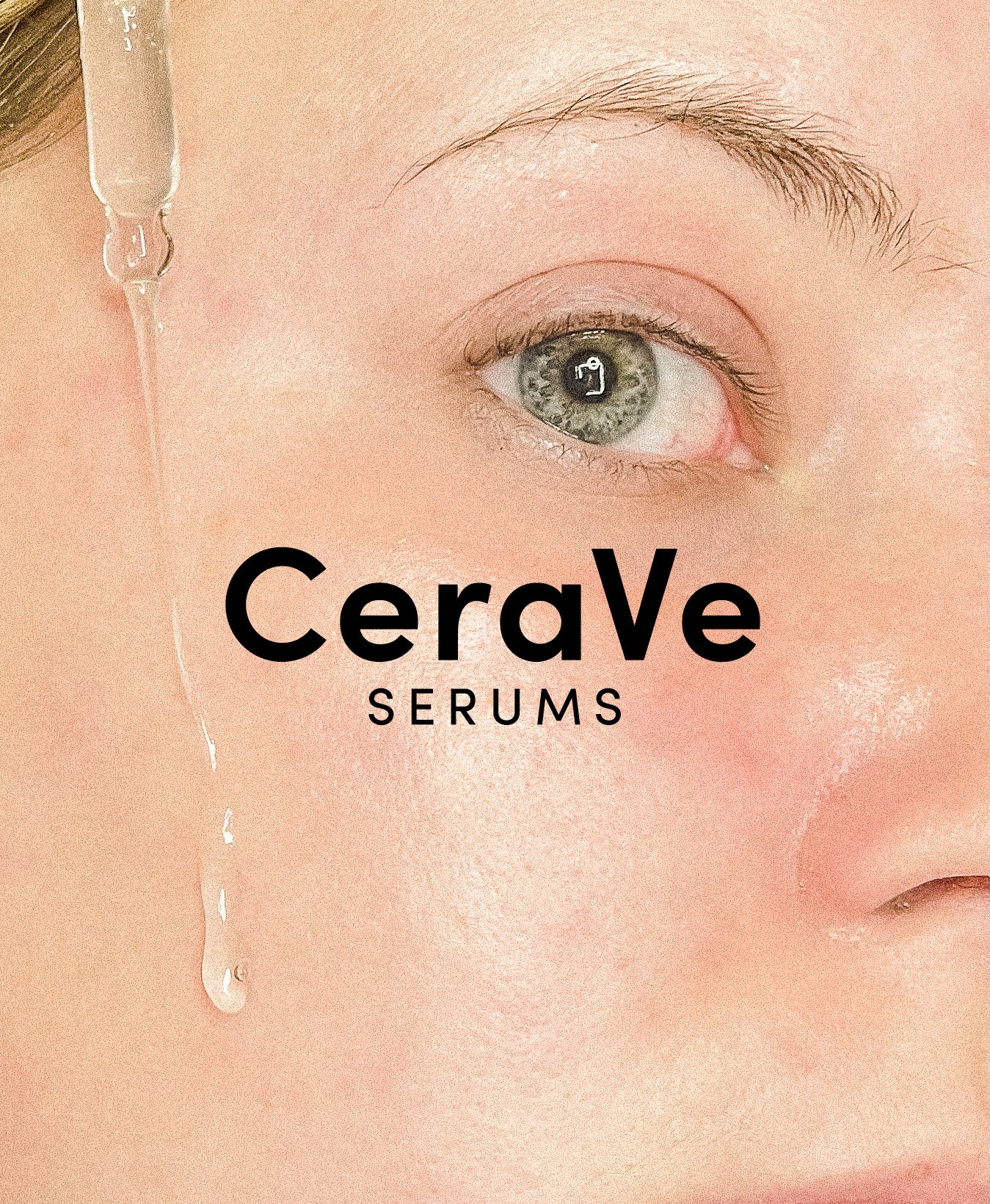
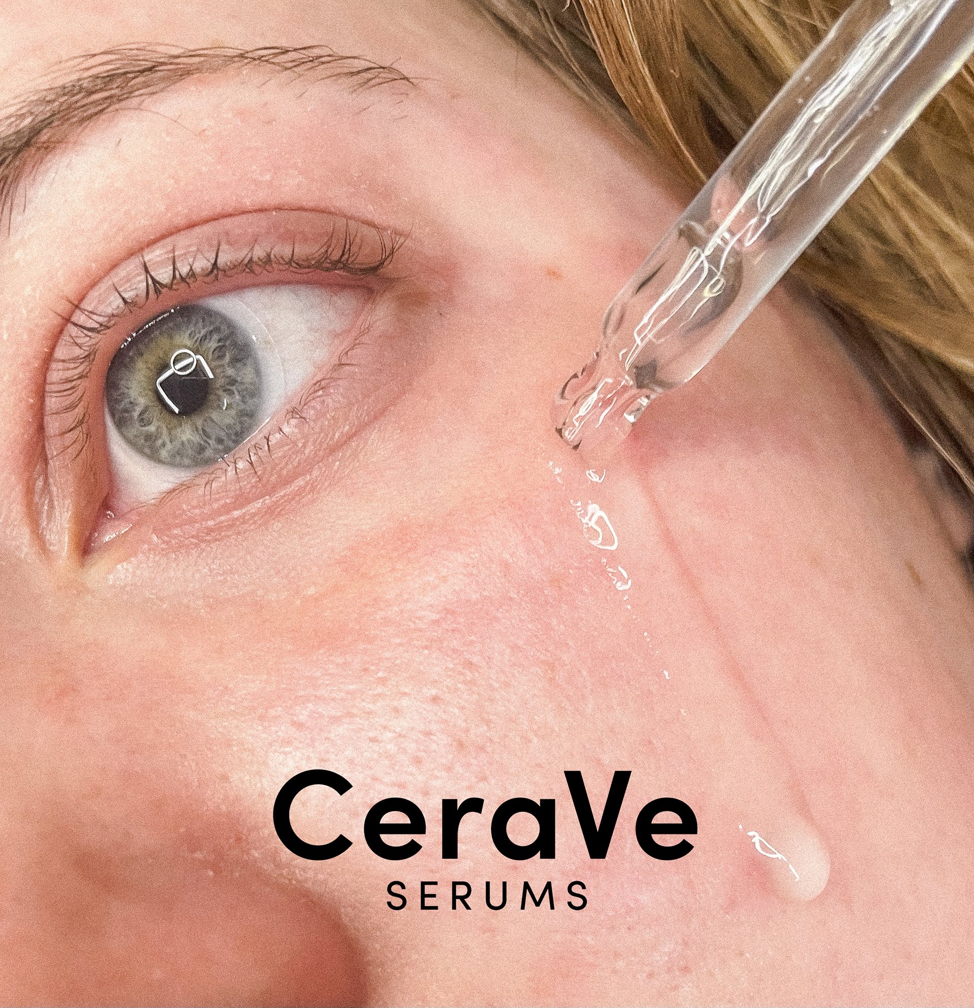
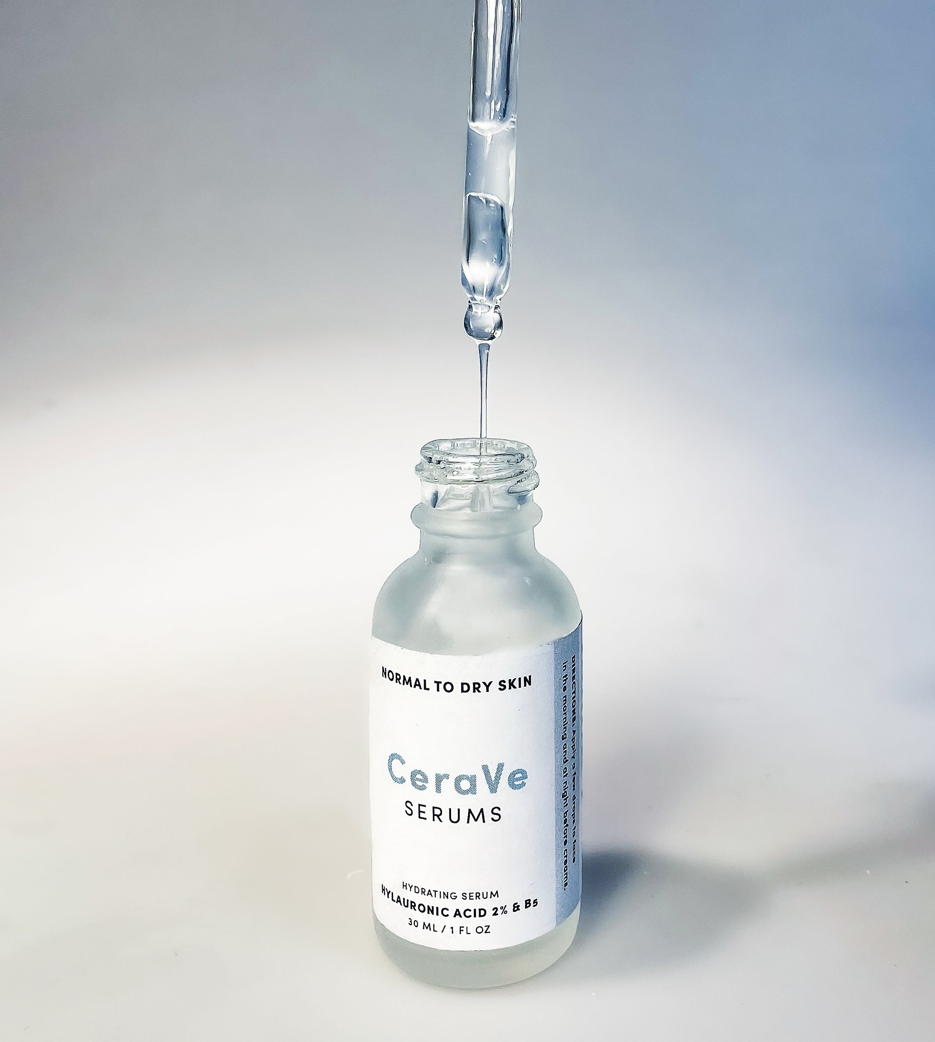
CeraVe Serums is a clean and ingredient-focused serum line that boasts CeraVe’s unique ceramide formula. With a new package design, the line appeals to younger consumers looking for a new and cost-efficient product from their favorite staple brand.
Experimental designs for a scientifically-focused brand
The background.
CeraVe is a skincare giant, known for its effective and simple ingredients. The cheaper price tag draws in younger consumers who often have little money to their names.
The goal was to create a new scientifically-based serum line for CeraVe reflecting a cleaner look while staying true to the established and trusted brand identity. The past few years have shown concentrated ingredient serum lines increase in popularity among younger generations. While CeraVe has had its own moment in the spotlight, a serum line from an already trusted brand would certainly become the hottest new product and eventually become a staple in consumers' homes.
The process.
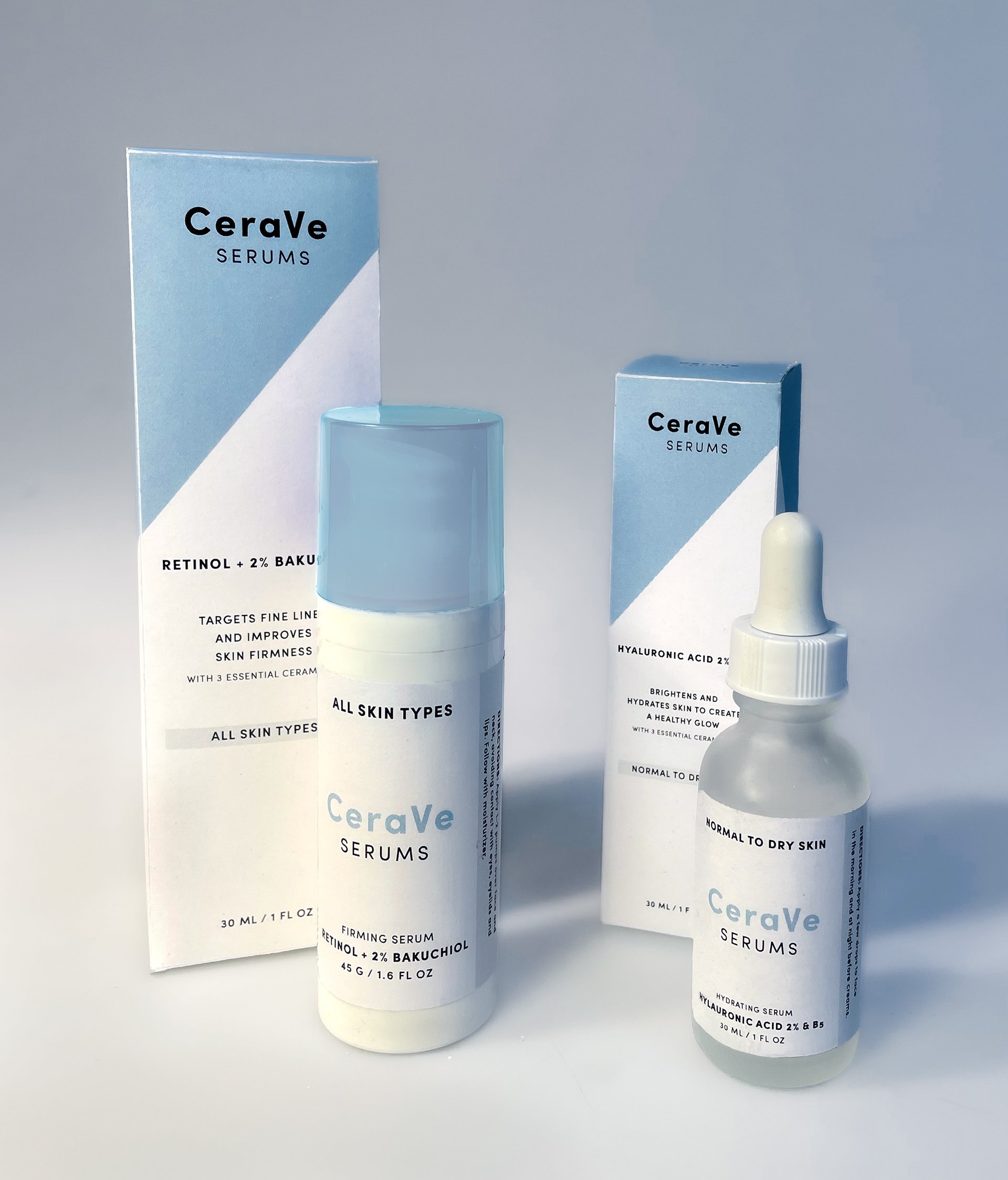
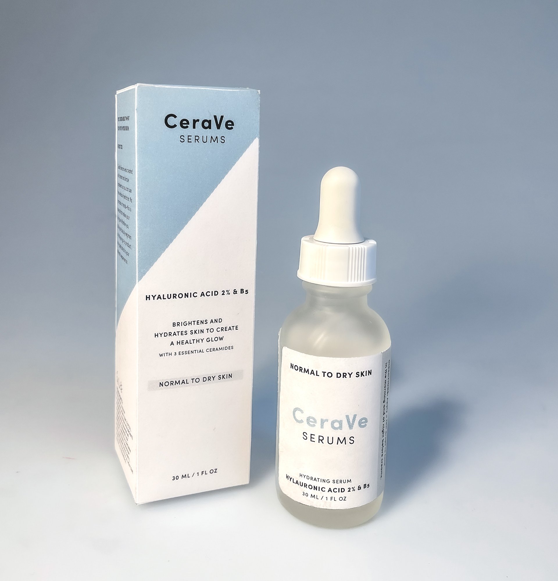
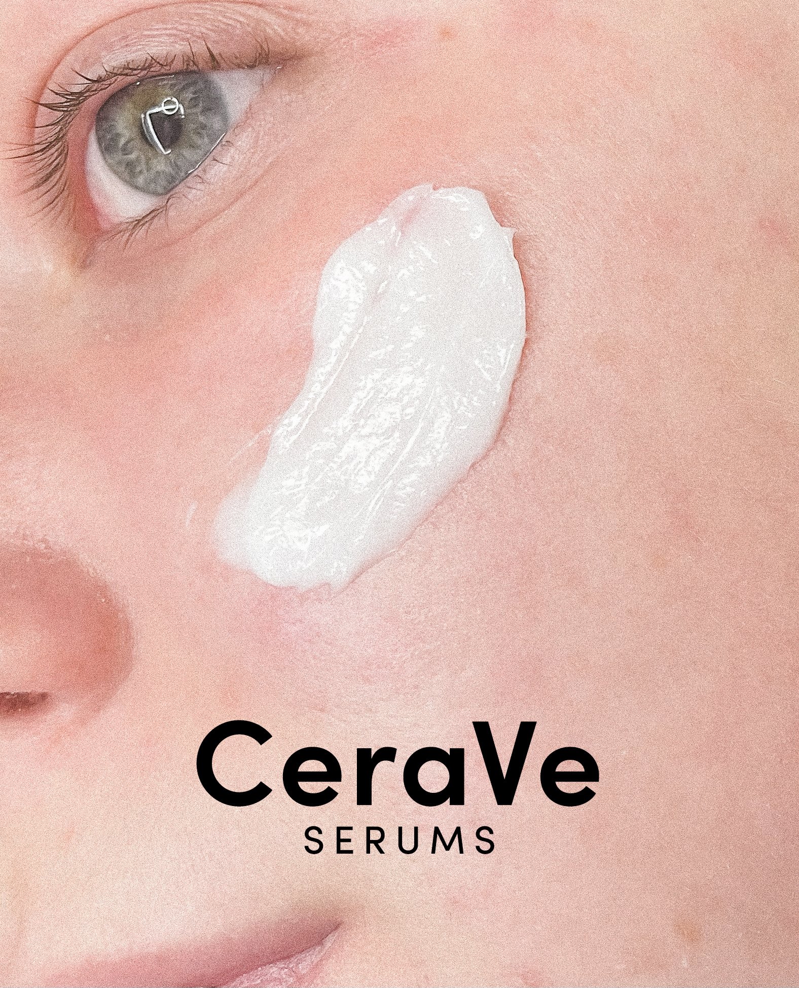
In order to keep a hint of the original brand in the package redesign, CeraVe's diagonal motif was repurposed on the package wrapper, creating movement as customers turn the box. My aim was to keep the type and palette simple to reflect the concentrated ingredients in each serum, free of parabens and other harmful chemicals. Three different products were ultimately created with corresponding packaging and labels.
Inside the box.
A pull tab was included on the back of the product box to create a unique interaction between the consumer and item. The box opens to display the serum and a backdrop of information and instructions on use. During initial research phases, lack of knowledge about use was the most frequent reason cited by hesitant potential users. The inclusion of this information and call to action would hopefully combat hesitancy and create a more inviting mood. The dieline below shows the signature blue color extended to the bleed with copy describing the serum contents.